Tag Archives: IPCC

Old Predictions Make Prejudiced Scientists

On Monday, the Alaska Dispatch News reprinted a Washington Post story by Chris Mooney titled Renowned climate scientist projects rapid rise in sea level, more intense storms The article discusses a research study Dr. James Hansen and 16 of his associates are about to release.  That study predicts gloom and doom even if the UN is successful in controlling climate change. The study has yet to be peer reviewed but is given priority by the Washington Post because as the article states:

It’s an alarming picture of where the planet could be headed — and hard to ignore, given Hansen’s reputation.

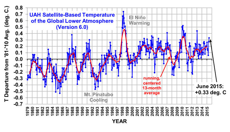
Why is it hard to ignore?  Why is gloom and doom by Dr. Hansen news?  Dr. Hansen has been predicting gloom and doom since the 1980’s.  He has been predicting rapid temperature rises and sea level mass destruction since 1982.  His 1988 projections in front of Congress were wrong.  This graph from a Skeptical Science article defending Hansen shows three Hansen predictions.  Scenario A predicted changes with carbon dioxide near current levels: https://i0.wp.com/www.skepticalscience.com/pics/Hansen_1988.gif According to Dr. Hansen, we should be quite a bit warmer.  And I would argue that the black line drawn by Skeptical Science is a bit too aggressive.  Most temperature models show a rapid rise from the 1992 cooling following the  Mt. Pinatubo eruption, to the great El Nino of 1998.  Worldwide temperatures since 1998 have been largely unchanged.  The  Skeptical Science graph makes it look like there is a persistent uptrend that really stopped in 1998.

Climate research sites  UAH, and East Anglia University both show this.   As Skeptical Science said in the article, Dr. Hansen’s models had a too high climate sensitivity. English translation…his predictions were wrong.

Dr. Hansen is not alone, most early models at the IPCC were wildly high  in their predictions.  Climate models have had to be modified to reflect the lack of warming since 1998.   IPCC reports have been toning down the immediate impacts of carbon dioxide (and methane too), using natural climate variation as the reason.

They still think they are right, but natural climate variation appears to be masking the predicted results and their predictions  might take a long time to materialize.  Virtually every temperature based prediction made by the IPCC in the 2007 Climate Change Report was wrong.  The IPCC has now modified their positions to reflect this reality.   Not Dr. Hansen. Back in June of 1988, Dr Hansen is quoted in a New York Times article as saying the following to Congress:

that it was 99% certain that  the warming trend was not a natural variation but was caused by a build up of carbon dioxide and other artificial gasses in the atmosphere.

And in 2007 he had not changed his view one iota as these quotes courtesy of the Steve Goreham website demonstrate:

“…99 percent confiden t that the world really was getting warmer and that there was a high degree of probability that it was due to human-made greenhouse gases.”     —Dr. James Hansen on his 1988 Senate testimony, PBS Frontline, Apr. 24, 2007

Two years later he said:

“The climate is nearing tipping points. Changes are beginning to appear and there is a potential for explosive changes, effects that would be irreversible, if we do not rapidly slow fossil-fuel emissions over the next few decades.”     —Dr. James Hansen, The Observer, Feb. 15, 2009

“The greatest danger hanging over our children and grandchildren is initiation of changes that will be irreversible on any time scale that humans can imagine.”     —Dr. James Hansen, The Observer, Feb. 15, 2009

“Burning all the fossil fuels will destroy the planet we know, Creation, the planet of stable climate in which civilization developed.”     —Dr. James Hansen, letter to Barack and Michelle Obama, Dec. 29, 2008

Back in 1988, we knew much less than we do now and Dr. Hansen was 99% sure he was right.  How could anyone be that sure then or now?   Even the UN is only 90% sure that most warming seen since 1950 is man caused.  Some could be natural climate variation.  This is one extraordinarily difficult science discussion.  A rational person should have more doubt.

Now, Dr. Hansen believes even a modest rise in temperature of less than a degree C will be catastrophic.  I have doubts.  Dr. Hansen is so prejudiced in his view, I doubt he can produce a document that does not display his almost religious zeal on the subject.

Interestingly, the Washington Post decided to use Michael Mann as their independent scientist to discuss this controversial paper presented by Dr. Hansen. Mann would not have been my first choice.

Back in 1998, Dr. Mann produced a paper predicting rapid climate change.  It was the rage of the Climate Community for years. Al Gore used the Hockey Stick Graph as it was called in his film.  In 2005 the study was successfully challenged by Canadian mathematicians.  Dr. Mann has been at the center of a climate fire storm for some 10 years now.

Hansen and Mann share a common problem.  Both made wild predictions in the distant past and must either defend them or admit mistakes.  Neither has been willing to admit errors, and errors were made. Some times I don’t understand journalistic choices.  I cannot think of any duo more shrouded in controversy in Climate Science than Dr. Hansen and Dr. Mann.

All this begs a question – Why did Mr. Mooney give Dr. Hansen such stature and why did he use Dr. Mann as a source confirming the story?

Note to the IPCC — Develop Realistic Goals

The IPCC has a global temperature goal for the World that makes no sense.   The leading “authority” on climate wants to keep the world temperature to less than 2 degrees C higher than it was at the beginning of the Industrial Revolution.  The Earth has already warmed over a degree C since 1750. This makes the IPCC limit  something less a than 1 degree C from current temperatures.

Natural climate variation makes the goal unattainable in the long run.  At some time in the future, the world will change (probably begin cooling) in  a way the IPCC failed to anticipate.   Nobody can make such a precise temperature guarantee.  Our knowledge of the science is simply too primitive.  And yet the goal is repeated over and over again.  I see references to the goal almost daily.  A goal that is nothing more than a wild ass guess.

We live in an ice age cycle and have been in this cycle for some 2.5 million years.   Average Antarctic temperatures as calculated using ice cores during the last three ice age cycles (about 400,000 years) have varied by about 13 degrees C.  Average Antarctic temperatures have been 8 degrees colder than today, and the coldest place on earth averaged 5 degrees C warmer some 130,000 years ago.  Most of the time it’s colder.

We are living in the Holocene, a 10,000 year period of very stable temperatures.   When one looks at the Vostok Ice Core from Antarctica it is clear that the Holocene is a surprisingly stable time from a temperature perspective.  Nowhere else on the chart does the climate stay stable and warm for 10,000 years.

Now let’s take a peek at a Greenland Ice Core that only goes back about 10,000 years.  This core takes place entirely within the Holocene and covers most of the period.

https://wattsupwiththat.files.wordpress.com/2013/03/gisp2-ice-core-temperatures.jpg

This ice core indicates that we have spent most of the last thousand years in a relatively cool period of the Holocene.   The recent warming has brought us up to the average.  The average temperature for the last 10,000 years in this particular part of Greenland was about the same as it is right now.  The chart stoped some 95 years ago and back then the world was about .7 degrees colder than it is today.   Add that bit back in and were about average for the Holocene.

The world has warmed rapidly, but there are lots of periods along the chart that are more severe.  Yep…wild natural climate variation…in a calm period of the ice age cycle.  Hmmm…..

I’m not a big fan of ice cores because they provide climate for a single location and regional climate varies more wildly than the world as a whole.   But if Greenland has varied by more than 3 degrees C at a time when the entire planet was unusually stable and warm, maybe a 1 degree C goal is for the world includes just a bit of wishful thinking.

Remembering that the world has warmed steadily since the end of the Little Ice Age, let’s look again at recent temperature data provided by East Anglia University in the UK.

gtc graph

Wild annual variation everywhere.  My favorite section…from 1863 to 1878, the world warmed by a bit over half a degree  C in only 15 years.  Warming before 1950 is presumed by the IPCC to be mostly natural variation.  Furthermore, the world warmed by almost .7 degree C between 1912 and 1942, a 30 year period not unlike the period between 1976 and 1998.  Since 1998, the pattern has been unusually stable.  More stable than at any time in the last 175 years.  No single year has varied from the prior year by more than .2 degree C during the last 17 years

One would never guess we are living (since 1998) in a time of relatively stable temperatures.    Reports in the media cast climate change as an accelerating problem.   And they could be right.  Perhaps natural climate variation is masking a disaster in the making?

But the IPCC could be wrong too.  The IPCC has been making temperature predictions since 1992.  The world went along as predicted until 1998, and then it didn’t.  7 years of right, 18 years of wrong.  7 for 25, not bad if your playing baseball.  I expect more from my scientists. When I look at IPCC data, I see guessing.  Wild Ass Guessing.

Problems are here, there, everywhere in the climate game.  Guessing is a part of the scientific process.  And guessing is everywhere as scientists attempt to predict future climate.  Carbon dioxide is higher than it has been in a really long time, and man probably plays a significant part in that impact.  But it is not the only input required in any attempt to predict future climate based on the past.

We have difficulty accurately measuring the Earth’s temperature both right now and in the past.  Arguments persist about volcanic impacts.  Sudden changes in the Earth’s magnetic field might matter.  Some think solar winds are important. The World was dramatically changed when Antarctica and South America became separate continents some 23 million years ago.

We know solar output varies and some suspect sunspot activity might matter.   Ice ages are presumed to be impacted by the location of the continents and by variations in the Earth’s orbit.   Land near the poles makes the world colder than when most land is near the equator is it was 50 million years ago.  The shape of the the earth’s orbit varies, as does it’s tilt.  And the earth wobbles too.  All 3 orbital variations are presumed to impact climate.

I suspect the IPCC is simply playing politics.  They need the problem to be immediate and urgent in order to secure funding.   And they know that our society lacks the political will to do what they say needs to be done.  If something bad happens, they can say I told you so.  If nothing happens they can blame natural climate variation.   And as long as the problem persists in the minds of the population, they continue to get funding!

The IPCC cannot afford to tell you the truth. It might impact funding.

THIS TRUTH —   The  scientific community is confident that man is impacting climate.  That impact is extraordinarily difficult to quantify,  measure,  or predict   When scientists use computer models they are guessing.  The models are not as precise as they should be and change wildly as new information come to life.   There is much we still do not know. The entire process is strongly influenced by  politics and economics . We all share the planet together.  We have a shared responsibility to be good stewards of the environment.  Society should act in a cautious manner because it might be important.

Gloom and doom sells newspapers and provides funding, but does little to advance the science.  I wish those that advocate climate change science in it’s current form were just a bit more circumspect and a bit less confident they are right.   Until I see some healthy skepticism from within the advocate community, I will remain skeptical.

Common Temperature Mistakes

Any discussion of climate change begins and ends with a discussion of temperature.  A Bloomberg article titled Holding Back Climate Change Isn’t as Hard as You Think is a typical example.  Apparently the International Energy Agency has looked at recent trends in energy use and is encouraged.  The third paragraph states the following:

Pledges already put forward for the Paris conference, including by the U.S., European Union and China, could hold temperature increases to 2.6 degrees Celsius. That’s significantly less of an overshoot than the 3.6-degree long-term gain in the IEA’s main scenario issued in November. The United Nations is trying to hold the increase to 2 degrees Celsius (3.6 degrees Fahrenheit) by 2100.

The article goes on to say that countries all over the world are becoming more energy efficient and are replacing coal fired power production with natural gas.

The article is a refreshing change from the gloom and doom normally spouted…but it makes the exact same group of mistakes most articles on climate make.

Mistake 1

Climate is not a static system.  Global temperatures changes wildly and in unpredictable ways.   The UN climate experts continue to make specific predictions even as they admit that background natural climate variation makes specific temperature prediction difficult.    This UK’s East Anglia University temperature chart illustrates the point:

http://www.cru.uea.ac.uk/documents/421974/487107/gtc_feb2015.gif/1abb0fcd-aecc-4cc3-ac4c-b6ea634379ea?t=1424695677621

UN experts insist that the change between 1910 and 1940 was natural climate variation, and that the change between 1976 and 1998 was mostly man caused.   Change since 1998 has been less than predicted by the UN.  The most recent UN Synopses Report blames natural climate variation for the lack of predicted change since 1998.

How can anyone guarantee any specific temperature in such a dynamic system?

Mistake 2

Climate experts do not make specific climate recommendations.  They make predictions using probabilities from computer models.   These models are not precise.  They routinely have a range of values as figure 3.2 from the 2007 UN report demonstrates.

https://www.ipcc.ch/graphics/syr/fig3-2.jpg

Working from left to right, the chart begins with a graph of the midpoint temperature change predicted by 2100 for four of the six different scenarios considered in the report.  Next to the graph is a bar chart with the six scenarios considered by the report (labeled B1 to A1F1).  Next to that are worldwide temperature graphics of three scenarios.

Let’s zoom in on the middle part of the image, the bar chart. The shaded area of the bar chart graphically demonstrates the range of values different computer models provide for the same scenario.  The bar charts are constructed to include 90% of the computer models run in the study.  One in ten computer models falls outside the bar graph.

News reports routinely report a single number.  There is no single number.

Mistake 3

The UN is not trying to keep temperatures to a 2 degrees C rise, they are trying to keep the rise from current levels to less than a degree.   The article simply quotes the UN stated goal incorrectly.   The UN stated goal is to keep temperature from rising by more than 2 degrees C since the beginning of the Industrial Revolution.  The Industrial Revolution began as the Little Ice Age was ending.  It was a particularly cool period of recent history.

The UN chose to start their calculating at this opportune time and nobody seems to care that the premier world climate agency is cherry picking data.  The UN has often stated that most warming before 1950 was natural climate variation. Why add more than 1 degree C of natural climate variation to the total?  It seems an odd convolution of the arithmetic.

Why the UN’s Intergovernmental Panel on Climate Change (IPCC) has made such a prediction is anybodies guess.  In a world where a volcanic eruption can cause a 2 degree C shift in a single year,  the IPCC’s goal of 2 degrees C since the Industrial Revolution has always been unrealistic and unattainable.

Mistake 4

Accurately calculating the correct historical temperature is very difficult.  Satellite data only exists for 35 years.  Data on the Oceans is spotty and new with the best data beginning in the 1990’s.  We have only a single data point for all of Antarctica.

Direct data in any form is only 200 years old and the best data has been gathered since the 1990’s.  As predictions go back in time the data gets more and more approximate.  We have general ideas about what the climate was like 10,000 years ago (similar to today), 20,000 years ago (much colder than today — think ice sheets in New York City) or 130,000 years ago when we think it was quite a bit warmer than it is right now.  That information is much less precise than the mass of data being produced every day in the 21st century.

The approximate nature of old data makes small changes over short periods of time difficult to calculate or predict.

Data over 200 years old is indirect data using tree rings, soil bores and ice cores and other indirect and anecdotal evidence.  This indirect data is both regional and has a small sample size which means it is difficult to make precise predictions about the climate of just a few thousand years ago.

Ice cores provide long term data for a single specific location in the coldest place on earth.   Trying to predict climate in New York City some 500,000 years ago based on a the temperature in a single ice core in Antarctica is much less accurate than reading a thermometer.

Regional climate varies wildly and is not a good proxy for worldwide climate.  Most anecdotal evidence is made up of proxies for regional climates.  Small changes to the world climate ecosystem in years gone by will almost certainly be missed.  It is difficult to tell how important today variations are, given the poor historical data sets.  Maybe the climate we are seeing is extraordinary, maybe it’s all happened before?

And the data interpretation keeps changing!

Just a few days ago NOAA announced that they had found errors in recent temperature calculations that help explain the less warm than predicted climate these last 15 years.  Other climate groups are less sure, choosing to take a wait an see attitude. Perhaps they remember other climate missteps (Climate-gate or the Mann Hockey Stick Graph).

Just about every article using temperature data ignores the limitations the science faces.  Specific numbers are used in a world full of approximations and guesses.

And so it goes

IPCC Climate predictions change in AR5

Shortly after I left town for a 2 week trip to the East Coast, the IPCC released their latest assessment on climate change, it’s Fifth Assessment is nicknamed AR5.  Today I pulled up some of the report from the web.    It was full of surprises.

The press did not surprise.  Gloom and doom has been everywhere these past two weeks.   Lost is all the hoopla is a significant change in the way the IPCC makes predictions.  They have become more circumspect.    Gone are absolute short term predictions like this one from AR4 made in 2007:

For the next two decades a warming of about 0.2°C per decade is projected for a range of SRES emissions scenarios. Even if the concentrations of all GHGs and aerosols had been kept constant at year 2000 levels, a further warming of about 0.1°C per decade would be expected. Afterwards, temperature projections increasingly depend on specific emissions scenarios. {3.2}

AR4 included the following charts to help explain their short term temperature predictions:

https://www.ipcc.ch/publications_and_data/ar4/syr/en/fig/figurespm-5-l.png

Now look at what AR5 says:

It is more likely than not that the mean global mean surface air temperature for the period 2016–2035 will be more than 1°C above the mean for 1850–1900, and very unlikely that it will be more than 1.5°C above the 1850–1900 mean (medium confidence).

A quick peek at the East Anglia University  temperature data set will allow us to interpret what 1 degree C since 1900 really means:

The world average from 1850 to 1900 was about 0.7 degree C cooler than the year 2000 baseline used in AR4.   So the new report is saying that the world has about a 65% chance (more likely than not) of being about 0.3 degrees C warmer on average between 2016 and 2035 than it was in the year 2000.  They also say that temperature is very unlikely to be as high as 0.8 degrees C higher.

Compare that statement  to the chart from AR4.  The IPCC predicted  0.8 degree C above 2000 as a most likely case in the year 2035.    The AR5 report lowers their estimate and changes the way it is calculated.  AR5 deals with average temperatures over a period of time while AR4 made much more specific and higher predictions.  AR4 effectively ignored natural climate variation.  AR5 does not repeat the mistake.

AR5 includes two significant temperature prediction caveats.   They acknowledge that natural climate variation makes specific temperature predictions difficult in the short run and they included a statement on volcanic activity:

This projection is valid for the four RCP scenarios and assumes there will be no major volcanic eruptions or secular changes in total solar irradiance before 2035.

IF the earth experiences a significant  (Mt. Pinatubo equivalent) volcanic eruption, then IPCC projections will likely be wrong according to the IPCC.   How likely are Pinatubo equivalent eruptions?  Volcanic eruptions are measured using the Volcanic Explosivity Index (VEI).   Mt. Pinatubo was a 6.   A chart courtesy of Wikipedia describes VEI and offers their best guess for each classification.  Here it is:

https://climateswag.files.wordpress.com/2014/04/6ac18-veitable.jpg

This chart says both VEI 5 (Mt St. Helens) and VEI 6 (Mt. Pinatubo) eruptions happen at rates that are less than one every 100 years.   What are these guys smoking?    The Wall Street Journal published a chart that shows each VEI 5 or higher event in the last 200 years.

Between April of 1815 and August of 1991, the Earth produced 19 VEI 5 or greater eruptions.   Mt. Tambora,  got things started in April of 1815.   This category 7 event was really special.  5,000 feet of this Indonesian volcano disappeared in a single event.   There was so much crap in the air that 1816 was named the year without a summer.  It was followed by 14 category 5 events, and  4 category 6 events culminating with Mt. Pinatubo in 1991.

Recent history is going to give us the best data.  Recent history says the IPCC is ….well…wrong.   We probably will have a significant eruption before 2035.   I suspect wild ass guessing at the UN.  Mother Nature gave us 4 category 6 events in the 108 year period from August of 1883 (Krakatoa) to June of 1991 (Pinatubo).

I am glad AR5 noted the exclusion of volcanic activity and made some references to natural climate variation.  These inclusions make the work so much better. The admission really was necessary.  AR4 short term temperature predictions were so flawed that they had to do something to explain why they were so wrong.

AR4 was full of bad wild ass guessing….and at least  AR5 acknowledges that they might be wrong.  The IPCC admits that there is a one in three chance that they are being too aggressive simply because normal climate variation makes specific predictions difficult.  A VEI 6 Volcanic eruption will totally mess with their predictions.

Lets assume VEI 6 eruptions happen every 40 years or so.   A VEI 6 volcanic eruption between now and 2035 carries a 50% probability.  We must then reduce the probability that the IPCC predictions are correct by that 50% since they admit they assumed a zero probability.

I’m just glad to see the IPCC adjusting to the real world…at least a little bit.

Polar Bears, Whales, Climate Science and Exxon

Wow!

What  a day. Four different articles in Section One of the Anchorage Daily News worthy of a post.  Most days nothing catches my eye.  Not today….well it is April Fools Day.

  1. UN Court orders Japan to halt Antarctic whaling was the feature page 1 story of the day.   The court voted 12 to 4 against the Japanese claim that killing up to 1000 whales a year was a form of scientific research.
  2. Researchers use DNA to trace lineage of polar bears was also a page one story.  A University of Alaska Fairbanks study used DNA evidence to demonstrate that the Polar Bear, Black Bear and Brown Bear have specific genetic histories.   The article went on to discuss the Endangered Species Act and the use of computer models to try to place the Polar Bear on the Endangered Species List.
  3. Exxon: Climate Change Policy Highly Unlikely to Limit Fossil Fuel Sales appeared on Page 3.   This article featured arguments between Exxon scientists and Environmental scientists about the relative costs and benefits of fossil fuels to society.  Surprise…they disagree.
  4. UN report: Global warming dials up our risks made it’s appearance on page 5.  The UN released a 32-volume report on climate on Monday.   This AP article discussed the impact climate change will have on food production.  The article talked about the impacts on poor people and the impacts on fine wine and coffee too.

There you have it, four wonderful April Fools Day treats in the first five pages of  my local paper.

Article 1 – Whaling in Antarctica

Apparently, last year the UN’s highest court had a trail.  In that trial, the Japanese government claimed that killing up to 1000 whales a year in the Antarctic was being done as a form of scientific research.

The Japanese position fails the laugh test.  When a legal position is so bad that others witnessing the lawsuit might actually laugh during the argument, that position has failed the laugh test.  Trust me, no lawyer wants to present a position that fails the laugh test.  Japan just failed.

This story says  something about Japan and about the UN too. 4 judges agreed with the Japanese position?!  And it took the court months and months to come to this conclusion?  World politics is a constant source of amazement.

Article 2 – Polar Bears

When I first started reading about Polar Bears, the conventional wisdom was that they became a distinct species about 200,000 years ago.   Perhaps two years ago, early DNA studies changed that to 600,000 and then another study last year said it could be as high is 4 million years.   This study pegs the change at 1.2 million years plus or minus.  And the study acknowledges that the time clock being used is approximate.

The lead scientist, Dr. Matthew Cronin, has been a vocal critic of the Endangered Species Act.   He has made, according to the article,  the following statements about the listing of the Polar Bear as an endangered species

It seems logical that if polar bears survived previous warm, ice free periods, the could survive another.

and

This is of course speculation, but so is predicting they will not survive, as the proponents of the Endangered Species Act listing of polar bears have done.

and

I don’t think you should base endangered species on predictions and models.  It should be focused on real-world problems.

All this was music to my ears. No so for Dr Steven C. Amstrup, principal author of the report recommending the ESA listing.  He called Dr Cronin’s study incautious and misleading.  Dr. Amstrup then pointed out that the current warming cycle was happening much more rapidly than had previous cycles.

Wrong.  The world is predicted by IPCC climate scientists to begin rapid warming soon. The World has been warming for over 200 years, but most of that has been natural climate variation.  The 2007 IPCC Climate Synopses predicted immediate warming.  The world was supposed to be about .2 degree C warmer than it is right now and that warming was supposed to accelerate with time.  The IPCC was wrong.

Warming to date is well within the normal range of the last 10,000 years.  The Earth warmed at a relatively rapid rate between 1993 and 1998, which also included a climate changing volcanic eruption and a strong El Nino.  Warming stopped and has been relatively stable since 1998 as this Satellite Temperature chart demonstrates:

https://i0.wp.com/www.drroyspencer.com/wp-content/uploads/UAH_LT_1979_thru_February_2014_v5.png

Perhaps Dr. Amstrup is just a tiny bit defensive.   He based all his arguments on climate models that have …at least so far…been wrong.

Article 3 Exxon vs Environmentalists

This article seemed perfect to me for April 1st.   Exxon and the Environmental lobby differ on the relative value of fossil fuels.   Duh!  Talk about a firm grasp on the obvious.   The article can be summed up by a single paragraph about halfway through the article.

Exxon and the environmental groups agree that climate change is a risk and that society will take steps to reduce emissions from fossil fuels to slow the buildup of greenhouse gases in the atmosphere.  They differ, however, on how drastic society’s response could be, and what would cost more — severely restricting fossil fuel consumption or not doing so and allowing more carbon dioxide to build up in the atmosphere.

Exxon thinks emissions will peak in about 2030.  The peak level of emissions will be less a risk than the environmental lobby predicts.    I have no idea where the truth lies.  Vested interests are everywhere.   The article really broke no new ground and provided no new information.

Article 4 — UN Report on Climate

Our local paper ran an AP story titled UN Report: Global warming dials up our risks in today’s paper.  I cannot find the article at AP or at adn.com (The Anchorage Daily News website).  I found stories with the same title.   I also found a story with the same title written by the same AP writer, but the story was completely different.  The Anchorage Daily News has a history of editing AP articles, so I read the online AP article.   The two articles are completely different. I have never encountered this before.

It does feel a bit like an April Fools Day prank…on page 5 of the Anchorage Daily News.

My local newspaper version of the AP story is an awful story.  It focuses solely on food supply issues caused by global climate change.   I wish I could find a way to link it.   The article mixes starvation in India with fine wine and coffee in the developed world.  Global climate change will change food availability and costs according to the article.  And not in a good way.

The article talked about potential starvation in India.     Yep, as India goes from a country with a billion people to a country with 1.5 billion people, food is going to become more of an issue.   Perhaps birth control or lack thereof might be a part of India’s food supply problem.   Maybe even more important than carbon dioxide levels in the atmosphere?


Mt. Tambora – A Mann Hockey Stick Problem

Whenever I look at the Mann Hockey Stick reconstruction of past climate I am ever awestruck by the small amount of temperature change depicted during the first 900 years of the chart.  It just doesn’t seem possible.  Very nearly no climate variation for hundreds of years, and then presto, lots of variation.

I often wonder what the powers that be at the UN must have been thinking in 2002 when they made the Mann Hockey Stick Graph the new climate standard.  A new, untested theory with multiple indications of probable sloppy mathematics; science is not supposed to work that way.  It is still around, and still defended vigorously by many in the climate community.

Here is a copy of an image of the 1000 year Mann graph I pulled from a Skeptical Science web  post defending  Mann’s work:

Climate variation shown before 1950 is, according to the IPCC, mostly natural climate variation. The increase in variation started at about the same time direct measurement replaced indirect measurement.   This chart begins using direct measurement in 1902.  Interesting….and odd too.

The UK’s East Anglia Climate Research Unit (CRU) has direct measurement data that begins in 1860.  NOAA data dates back to 1880. Why start in 1902?   And when does the data begin to look like a hockey stick?  Hmmm…1900…enough said.

Zoom in on 1815 if you can.  A very small decrease in temperature that had been trending downward since about 1775, stops in about 1830.   The net change for the entire period was only a bit over -0.1 degree C.  Something is wrong.  This should be a time of spectacular natural change.  The very small, nearly no change shown makes no sense. Why?  Mt. Tambora.

Mt. Tambora is a 9354 ft. mountain in Indonesia.    It used to be over 14,000 feet tall.  One day in April of 1815, the top 5000 feet went away.  Imagine if you can, an eruption 150 times larger than the Mount St. Helens eruption of May 18,1980.  Tambora is  the largest volcanic eruption in recorded history.   The eruption has been estimated to be 10 times the size of the Mt. Pinatubo eruption of 1991.  Mt. Pinatubo has been credited with cooling  the world’s weather by about 0.5 degree C for 2 years.

Tambora was and still is a big deal.   1815 has been called the year without a summer because the air pollution from the eruption made the world a darker and colder place. Five degrees F. colder or so says a USA Today article. The winter of 1815-16 was a spectacularly cold one all over the world.

An eruption that big should have caused a significant temporary change in the world climate that would have lasted for several years, perhaps longer.   Look at the Mann Chart.  Nothing.   Where did the Mt. Tambora impact go?

Skeptical Science provided the following temperature reconstruction as a defense of the Mann work on their web site.  The two studies supposedly confirm each other.  The new study has an advantage over the Mann work in that it covers a shorter period of time making it easier to read:

Where is the -3 degree C blip in 1815?   Nothing, Nada, Zip?  Whaaaaat? A smaller but significant eruption in 1883, Krakatoa, is not visible either.   Another significant eruption, at Huaynaputina, in 1600 fails to make the chart.   Too small to be detected I suppose.  Changes in the 20th century are here, there and everywhere.  This inconsistency  has never made sense to me.

The Mann reconstruction is a Northern Hemisphere reconstruction of a 1000 year period.   At it’s beginning settlers in Greenland grew hay and their diet was 80% farm animal based including cattle.  Yep cattle in Greenland.   400 years later, most settlers were gone.  The survivors ate primarily whatever they could harvest from the sea.  And all the while the world only cooled 0.1 degree C?  I don’t think so.

20th century warming  7 or 8 times that much?

Most warming before 1950, and some warming since 1950 is presumed to be natural climate variation. No natural climate variation for centuries and then magically lots!?  AND it coincided with a change in the data source.  Come on guys.  Get REAL.

I don’t doubt that the world has warmed, but I do believe that all the data before 1902 in the Mann reconstruction is a guess….a wild ass guess.   Mann has claimed the entire Medieval Warming Period was a regional event or so he is cited in a Scientific American article published in 2005.   I don’t buy it.    Greenland was warm for hundreds of years.   Records all over Northern Europe support the notion that the warmer weather was widespread and lasted for hundreds of years.

Before the Mann study it was widely believed that the Medieval Warming Period was warmer than Mann claims.   Simple charts were included in UN studies as  this one that was featured in the first study published by the IPCC in 1992..

https://i0.wp.com/www.science-skeptical.de/wp-content/uploads/2009/11/lambh23.jpg

The Third Assessment of Climate (TAR), published by the IPCC in 2002 featured a new world order, the Mann chart.  Magically, the Medieval Warming Period disappeared.

Now consider this.

The scale for measuring volcanoes is called the Volcanic Explosivity Index.  It goes up to 8.  Mt. St. Helen’s was a 5, Mt. Pinatubo, Huaynaputina and Krakatoa were in category 6.  Mt. Tambora was a 7.  The average 7 is 100 times larger than the average 5.

Some 26,500 years ago a big chunk of New Zealand went away in the world’s most recent category 8 eruption at Taupo Volcano.  A category 8 eruption is on average 10 times larger than a category 7.  Imagine what that must have done to the ecosystem.  Now there’s a tipping point, Nature’s tipping point.

This happened during an ice age cold spell.  Wow.

Now consider this.

Taupo was a boringly average category 8.   75,000 years ago, plus or minus 5000 years, the Indonesian area blessed us with Toba, the largest category 8 known to man.  This beast was the equivalent of 3 Taupo’s and is suspected of starting a 1,000 year cooling period.

I’ll bet you right now that science will discover more significant volcanic activity.  Some of that activity will have global climate implications.   Who knows how many more will be discovered that have the ability to impact climate as we look back in time?

Dr. Hansen’s Dream World – Part 3

This post is the third of 3 dealing with an article published on December 3rd by Dr. Hansen and 17 other scientists.  The article’s basic argument is that carbon dioxide is creating an energy imbalance.   They attempt to measure the energy imbalance, and make predictions about the future.

The article is refreshing in that it finally addresses many of my objections about the IPCC.  It actually discusses other possible drivers for climate change and tries to provide a compelling argument for why these other drivers of climate are not important.   I am less confident than I was before reading the article, but I still have doubts, many doubts.

Dr. Hansen made up his mind about the importance of carbon dioxide before most of the research used was performed.   He has been an advocate for a really long time.   And many of his arguments use data with very short histories.   The data displayed about the sun only goes back 40 years.

https://i0.wp.com/www.plosone.org/article/fetchObject.action

I want to see what happened during the last cooling cycle from 1940 to 1976.   Information that went back to the beginning of the Little Ice Age would be even better.

The Energy Imbalance discussion uses data from buoys.  The changing amount of energy stored by the oceans is used as an indicator that the world is accumulating energy.  That it is out of balance.  Virtually all of the data used in the calculation is less than 10 years old.   It is more a snapshot in time rather than a trend established over a long period of time.

And I worry about the data set.   There are about 4,000 buoys spread out around the globe.  They drift with the currents and too many are near land.  Many of the buoys have only been available since 2005.   The data is so new and so important to his conclusions that I suspect lots of wild guessing.

The article also dismisses all the short term temperature predictions in past IPCC reports.  It uses the oceans and the large ice masses near the poles as reasons why the horrible changes predicted have been late.   This effectively eliminates one of my main complaints about the IPCC….stupid short term predictions.

And they bravely encourage widespread use of Nuclear Power.   I think Nuclear power is a necessary part of any green answer.  Unfortunately with the exception of China, the world is walking away from nukes.

The article paints a bleak picture of the world unless we make the following changes to the way we generate energy.

  1. The article advocated carbon trading on a worldwide scale.
  2. They advocated widespread use of wind and solar.
  3. They advocated widespread use of Nuclear to replace both coal and natural gas generation.

Carbon trading requires all the countries of the world to agree.   That is unlikely to happen.  Without a worldwide agreement, carbon trading only works for the countries that don’t join.   Today, China and the USA have a huge trading advantage when trading with the EU because they don’t have to worry about carbon taxes.

Wind and solar will continue to be developed, but they have limitations due to Mother Nature.  If and when a better battery is developed,  their use can expand.  Until then, their use will be limited.

Germany has so much solar that their power grid is developing reliability issues when solar is not available.    Germany’s ability to manufacture goods may be impacted.   Germany’s 21st century solution, a brand new coal fired power plant!

The world has changed a lot since 2006 when Al Gore won a Nobel Prize for his political commercial masquerading as a documentary film.   Dr. Hansen and his cohorts barely got any press for their latest bit of gloom and doom.  The world has passed them by.  Why?

They have been gloomy for a long time. Doom failed to arrive on schedule.   Throw in climate-gate and the Mann Hockey Stick debate; the group has lost some credibility.  How did they get into this position?

I think it starts with their mind set.  Dr. James Hansen and his comrades live in a political dream world.  Why do I say they live in a dream world?  Let me count the ways:

  1. They think the science is so compelling that there is no other plausible view.  When Dr. Hansen and 17 other scientists wrote the article I am critiquing, they declared there were no competing interests.  The world does not have unlimited funds.  Every dollar spent on global warming is not spent on something else.  Things like world overpopulation, starvation in Africa,  AIDS, Cancer, over fishing the oceans, and safe drinking water all have the potential to be competing interests.
  2. This group lives on government funds.  Every other need of the government is a competing interest.
  3. Competing interests go beyond government money.  Jobs are at stake in the coal industry.   Wind turbines kill birds, including some endangered species.  People dislike the appearance of wind mills in pristine areas.   Solar panels take up lots of space and must be imported, impacting trade.   Nuclear, well it’s Nuclear, need we say more.
  4. The carbon dioxide is evil climate group has made many mistakes.  These mistakes have given the skeptical community reason to doubt their results.  They have been caught cooking data (Climate-gate), adopting questionable scientific theories (The Mann Hockey Stick Graph) and their short term predictions have been wrong.  Horribly wrong.
  5. They have been too secretive and too vague.  They have argued against sharing data with skeptics.  If the data is good, they should be doing exactly the opposite.  In 2005, the Scientific American  wrote an article defending this use of secrecy shortly after the Mann Hockey Stick data began to be attacked by skeptics.   The Scientific American defended Dr. Mann aggressively.  Interestingly, Dr. Hansen in his new article, appears to argue that the specific temperature conclusions in the Mann Hockey Stick Graph were wrong.
  6. The politics has turned against them.  A worldwide recession, cheaper and more plentiful fossil fuels, and the Fukashima Nuclear Disaster have changed the political landscape.   Global warming advocates are failing because people fear Nuclear Power.  Germany and Japan are abandoning their Nukes, only China seems willing to build new Nuclear plants.
  7. Long ago they made one very large mistake, they let a politician become point man for the cause, Al Gore.   Mr. Gore is driven by political realities.  He will never advocate Nuclear Power.   Green energy without Nuclear energy does not work.  It will not work until a cheap way to store electrical energy is developed.    The green community has been advocating a solution that does not work.  This is now becoming obvious.
  8. They expect the United Nations to be an effective force.   This expectation never made sense.   Much is made of the original Kyoto Treaty.   A treaty that did not work.  Carbon emissions soared during it’s implementation period. Kyoto created too many winners and losers.   Russia got special treatment.  India and China got a free ride.   It was politically unacceptable in the USA.
  9. China has become significant politically.   Any solution must involve China.  In a few years  China will produce a third of the world’s anthropogenic carbon dioxide. The 2009 Copenhagen attempt at a new treaty failed in large part because there was no way for the world community to get China to do what they felt needed to be done.  Absent political concessions in China, the USA will never come on board.   The two largest economies in the world must be a part of any real agreement.
  10. Stop living in the past.   Dr. Hansen has been an advocate of counting all the pollution a country has produced since the beginning of the Industrial Revolution when dictating what each country is obligated to do to stop warming.   I personally don’t buy the argument scientifically, but that’s beside the point.  This approach has effectively given China a pass.  It provides them with an excuse not to cooperate.
  11. Global warming hawks need to learn how to compromise.   Natural gas is a cleaner burning fuel than coal.  While it is not as good as Nuclear as a base load fuel, from a carbon dioxide perspective, it is much better than coal.   No new plants are currently under construction.   Decades will pas before any new Nuclear plants come on line in the USA. And old plants are being retired as we speak. Dr. Hansen and his cohorts should be adopting natural gas as a lesser of two evils while they wait for technology to provide a better choice in the short run.

I would be more convinced by the arguments in Dr. Hansen’s article if Dr. Hansen hadn’t made his mind up about global climate change in the 1980’s.   15 years ago doom was coming and coming soon.   His article still says it’s coming, but it could be delayed by centuries.   It is a better argument than the immediate gloom arguments of 15 years ago. Unfortunately for him, politicians usually don’t respond to problems in the indefinite future.

And still  I wonder.   Is Dr. Hansen right now….or is he just selectively looking at data to defend a position he has held for 30 years?   Only time will tell….lots of time.

Dr. Hansen’s Dream World — part 2

It’s time to beat up on Dr. Hansen some more.  My last post only dealt with the introduction of  a new article published by Dr. Hansen and 17 other authors“Dangerous Climate Change”: Required Reduction of Carbon Emissions to Protect Young People, Future Generations and Nature is the less than catchy title. This post deals with the first section of the body of the article, the section that deals with temperature.

Oh! First a sidebar…NASA (Dr. Hansen’s employer) Climate Research Funding  and Columbia University funding helped pay for the project.   I don’t mind NASA funding research, but I’d rather have them not use their own employees….it feels like we (the people of the United States) are paying them twice.

In part 1 of this discussion I mentioned that Dr. Hansen had been somewhat cavalier with his data selection.   I accused him of using regional data, and of cherry picking data.  But Dr. Hansen does so much more.  He uses old data, he misrepresents data and uses his own work as a resource.

He does all that within the first major section of the article, which is called Global Temperature and Earth’s Energy Balance.   In a subsection titled Temperature, he begins by showing temperature graphs.  The following graphs are displayed:

https://i0.wp.com/www.plosone.org/article/fetchObject.action

I find those charts difficult to read and I think they misrepresent the recent past.  Here are three other charts that better tell the story.   First is the East Anglia University chart that was prepared in 2010:

https://i0.wp.com/www.climatechangefacts.info/ClimateChangeImages/cru_gtc.gif

The total amount of temperature variation shown is less on the East Anglia chart than on the charts provided in the article.  A lot less.  Dr. Hansen has a rationale for using only average data, but I don’t like the choice.  The 13 year average data masks all recent data and makes details much more difficult to interpret.   It in effect spreads the El Nino data out for a long period of time.

I like the older (pre 2013) East Anglia charts.  The University changed something in 2013 that made 1998 look cooler relative to the rest of the chart.  I suspect data fudging and prefer the older charts.

Next is a 45 year chart I used in my last post.  It shows East Anglia data, and  2 satellite sets of data:

https://i0.wp.com/upload.wikimedia.org/wikipedia/commons/thumb/7/7e/Satellite_Temperatures.png/800px-Satellite_Temperatures.png

and finally the current UAH chart:

https://i0.wp.com/www.drroyspencer.com/wp-content/uploads/UAH_LT_1979_thru_November_2013_v5.6.png

I like the UAH data best.  It is the most current and the most detailed.   I am fascinated by the changes in data from month to month.  The data Dr.Hansen chose makes it look like there is a steady march upward with a small pause at the end of the chart; the other charts tell a different, less ominous sounding story.

In the text that appears with the graphs, Dr. Hansen tells his story complete with multiple cites, including one to an article by an expert.   Yep, he cites himself.  He does that on 3 different occasions within the first two sub-section of the article.

A little further into the piece we get this statement:

The Greenland and Antarctic ice sheets began to shed ice at a rate, now several hundred cubic kilometers per year, which is continuing to accelerate.

An article by Edward. Hanna et al. is cited as the source material for the statement.   The article was published in Nature in June of 2013 and the article has this to say about Antarctica:

It remains unclear whether East Antarctica has been gaining or losing ice mass over the past 20 years, and uncertainties in ice-mass change for West Antarctica and the Antarctic Peninsula remain large.

Parts of Antarctica are losing ice, other parts are not.  And there is lots of uncertainty. Surface ice adjacent to Antarctica is at record high levels according to the National Snow and Ice Data Center.

https://i0.wp.com/nsidc.org/arcticseaicenews/files/2013/12/Figure4a-350x416.png

I am sure that if the world warms, ice will melt.  If enough melts it could become a serious problem. But Dr. Hansen overreached in this area.

The next sentence of the report (after the Greenland stuff) is as follows:

Mountain glaciers are receding rapidly all around the world  with effects on seasonal freshwater availability of major river.

Dr. Hansen provided two cite references for the Mountain glacier section.  Both were published in 2007.  That’s really old data in this field.  Recent studies blame some of the melting  not on carbon dioxide, but on particulate matter.   Air pollution turns the snow a slightly grey color, which causes it to melt faster.  It’s still a man caused problem, but the solution to the problem is to clean the air, not to eliminate carbon dioxide.

Oh…carbon black impacts melting in Greenland and the Arctic too.

The first of two cites supporting his argument for rapid melting referenced an article about the Andes; a part of the world that has not experienced significant warming.  The second site was the 2007 IPCC  Climate Change Report.   I was surprised to see this cite.  This part of the IPCC report is famous…or should I say infamous.  The Guardian ran a story on it in 2010.   The Guardian reported the following:

The UN’s climate science body has admitted that a claim made in its 2007 report – that Himalayan glaciers could melt away by 2035 – was unfounded.

The admission today followed a New Scientist article last week that revealed the source of the claim made in the 2007 report by the Intergovernmental Panel on Climate Change (IPCC) was not peer-reviewed scientific literature – but a media interview with a scientist conducted in 1999. Several senior scientists have now said the claim was unrealistic and that the large Himalayan glaciers could not melt in a few decades.

In a statement, the IPCC said the paragraph “refers to poorly substantiated estimates of rate of recession and date for the disappearance of Himalayan glaciers. In drafting the paragraph in question, the clear and well-established standards of evidence, required by the IPCC procedures, were not applied properly.”

So, in 2010, the IPCC admitted the cite referenced by Dr. Hansen was flawed.  And his other cite was both regional and at an odd location.

The IPCC makes several statements  in their 2007 Synopses report.  Two are applicable here.  1) Warming has been regional  with most warming occurring over land in the Northern Hemisphere and 2) climate on a less than continental scale is subject to wild swings which makes it difficult to predict.

In finishing up the temperature section of the paper,  the article discusses the changes seen in the world. We are told the following:

Mega-heatwaves, such as those in Europe in 2003, the Moscow area in 2010, Texas and Oklahoma in 2011, Greenland in 2012, and Australia in 2013 have become more widespread with the increase demonstrably linked to global warming

The world is a big place.  I can make any argument I want to by picking my location.  If I want to sound alarmist about tropical storms, I can discuss the disastrous impacts of the Typhoon that destroyed so much of the Philippines.  If I want to sound calming, I can discuss the record low number of hurricanes  in the Atlantic during the same period.

Both events happened.  Both are regional.  And both happened in a part of the world that has not warmed significantly in the last 30 years.

The article provides two cites for the statement saying these items are demonstrably linked to global warming.  One cite provides a statistical argument for extreme weather whenever there is any warming or cooling.  It is in effect an argument that says extremes will appear whenever the average weather changes.   Climate has not been changing recently, so Dr. Hansen’s conclusion seems to be unsupported by the cite. The second site deals with one event, the 2013 drought in Australia.  No link was provided to that reference.

In Part 3, I’ll look at Dr. Hansen’s evaluations as to why climate politics has stalled and what needs to be done.  Stay tuned.

Dr. Hansen’s Dream World – Part 1

James Hansen, world famous global warming hawk and perennial doom speaker extraordinaire, has just published a new paper titled Assessing “Dangerous Climate Change”: Required Reduction of Carbon Emissions to Protect Young People, Future Generations and Nature.

The article uses lots of short term data, cherry picks that data, draws worldwide conclusions from regional data, and makes ridiculous assumptions.   Opinion wanders willy nilly throughout the article.

I am ever amazed at what gets passed off as scientific research in the environmental community.  The article looks more like a legal brief than a scientific document.   Lawyers are paid to represent a client, science isn’t supposed to work that way.

Where to begin? Let’s start at the beginning.  The first paragraph of the introduction says the following:

Humans are now the main cause of changes of Earth’s atmospheric composition and thus the drive for future climate change

Humans are changing the climate, but are they the main cause and is that change the drive for future climate change?   I don’t think so.  Greenhouse gases, air pollution, carbon black, solar winds, gamma rays, volcanoes, hot spots in the sea floor, aerosols and variations in the Earth’s orbit all play a part.  Dr. Hansen’s preoccupation with man caused carbon dioxide is a gross oversimplification.

This article sites the 2007 IPCC report as their reference for the statement.  The IPCC report says they are 90% certain that man is responsible for more than 50% of the changes seen in worldwide  climate since 1950.  Changes before 1950 are considered normal climate variation.

Many of the predictions made in that 2007 IPCC document  have proven to be wrong.   Their specific short term temperature predictions have, so far at least, been way off the mark.   I have been wondering how the global warming community would try to tiptoe around that fact.  This article offers a glimpse into this new reality of global warming climate predictions with the following statement:

The climate response to this forcing and society’s response to climate change are complicated by the system’s inertia, mainly due to the ocean and the ice sheets on Greenland and Antarctica together with the long residence time of fossil fuel carbon in the climate system. The inertia causes climate to appear to respond slowly to this human-made forcing, but further long-lasting responses can be locked in.

Okay, I suppose.   Society’s response is an odd addition to the statement.

In 2007 the IPCC said warming was already locked in, now it’s still locked in….but the actual warming might not show up for a while….how convenient.    IPCC reports since 1990 have insisted that warming since 1976 has proven their case.  As soon as that warming wanes a bit, short term data no longer matters.

Lots of controversy in the very first paragraph of the introduction.   Wow.   I’d better move on or I’ll never finish this post.

The introduction continues with a few paragraphs describing  IPCC history, followed by a few paragraphs about energy use.  Near the end of the introduction, the article begins advocating for a serious reduction in total anthropogenic carbon dioxide emissions  with the following statement:

Our evaluation of a fossil fuel emissions limit is not based on climate models but rather on observational evidence of global climate change as a function of global temperature and on the fact that climate stabilization requires long-term planetary energy balance. We use measured global temperature and Earth’s measured energy imbalance to determine the atmospheric CO2 level required to stabilize climate at today’s global temperature

This paper does not use computer models, it simply looks at lots of regional data (cherry picked regional data) and draws conclusions based on those observations.  Correlations are presumed.  Many many identified events are presumed to be the direct result of a 1 degree C change in climate.   Factoids that do not support the position are simply ignored.

This study starts with three assumptions; 1)man is responsible for the energy imbalance they see, 2) if we severely reduce anthropogenic greenhouse gases,  an energy balance can be restored, and 3) climate stability will be achieved.

I think all three assumptions are likely wrong!  Man probably deserves some credit for recent warming, but not sole credit.   Remove all man caused effects and climate still changes.   The notion that any specific level of carbon dioxide in the atmosphere can all by itself stabilize climate at any specific temperature is… well…it’s just extra special stupid.   And it’s the base premise of this entire article!

Why would anyone ever assume climate in the world can be stabilized at any specific temperature?  We live in an ice age cycle.   It has been lots warmer than it is today and lots colder as this Antarctic ice core demonstrates:

https://i0.wp.com/blog.world-mysteries.com/wp-content/uploads/2010/11/ice_age_graph.jpg

Temperature varies by about 11 degrees C in the average ice age cycle.   The warm periods tend to be short, the cold periods tend to be long.   We live in the Holocene, an 11,000 year period of unusually stable warm temperatures.   Ice ages are presumed to be caused by the location of the continents and variations in solar irradiance due in part to variations in the Earth’s orbit.

The goal of the article is to keep temperatures at or below the temperature experienced in 1990, which is about 1 degree C higher than it was in 1750.   This  is an  unrealistic and unachievable goal.  Temperature is not now and has never been that stable.  Just look at the movement we have witnessed in  the last 45 years:

https://i0.wp.com/upload.wikimedia.org/wikipedia/commons/thumb/7/7e/Satellite_Temperatures.png/800px-Satellite_Temperatures.png

The late 1970’s were more than a degree cooler than it was in 1998.  1998 was a strong El Nino year.  In June of 1991, Mt. Pinatubo erupted, changing the climate for over a year and causing a decline of almost 1 degree C.    Just imagine what would happen if a volcano 5 or 10 times bigger than Mt. Pinatubo erupted.   We’d all be wishing for a warmer world.

If we did exactly as Dr. Hansen recommends, would the world magically become stable climatically? I don’t think so. It might be a bit cooler, but stability is an unachievable goal.

Surprisingly, there has been nearly no net change in climate since 1987.   In 1987 we were .2 degree C above the base line and in late 2013 we are still about .2 degree C above the base line.  Temperatures have the ability to warm and cool rather dramatically all by themselves and yet, these past 25 years have been boringly stable.

And that is a political problem for Dr. Hansen and the IPCC.

Sea Level Confusion

Mean sea level confuses me.   Intuitively I want sea level to be the same all over the world.  But it isn’t.   One reason the Panama Canal has locks, sea level on the Pacific side averages 8 inches higher than on the Atlantic side….and the tides are higher on the Pacific side too.   Without the locks, water would constantly be flowing from the Pacific side to the Atlantic side.

And sea level is not changing at the same rate all around the world.  Some places have a rising sea level, others falling.   Supposedly worldwide sea level is rising steadily as demonstrated by this chart courtesy of the Australian government:

Plot of global sea level from 1993 to 2012

NOAA keeps data for all the 50 states of the USA and that data generally shows a much slower rise….and in some cases no rise since 1990.  Something doesn’t make sense…and that confuses me.  Let’s begin looking at NOAA data for San Francisco.   The data for San Francisco is some of the oldest available.  It goes back over 150 years.  Here is the sea level data chart for San Francisco:

chart: Mean Sea Level Trend, 9414290 - San Francisco, California

San Francisco peaked in 1998 (a strong El Nino year).  NOAA also provides charts that show the change year to year.   They call these charts interannual charts.  Here is the interannual chart for San Francisco.residual1980.png

Since 1998 sea level is San Francisco has been going down.   How about Miami Beach Florida:

residual.png

Miami appears to have peaked in the 1940’s?   But the data shows no real net change in the 50 years the data has been kept.  NOAA must have changed where they keep data for this area as the data stops in the 1980’s.  But the data is interesting as it shows variations that should have predated man caused climate change.  The data does not match the San Francisco data.   It has less overall movement and it peaks at a different time. Now lets see how the Pacific Ocean has been doing by taking a peak at Honolulu, Hawaii:

chart: Mean Sea Level Trend, 1612340 - Honolulu, Hawaii

Honolulu has been rising, but slowly.  It looks a lot like San Francisco.  Let’s zoom in on the data since 1990 by looking at interannual variation chart .

residual1980.png

The change since 1990 has been minimal.  The area above the zero line on the chart roughly equals the area below the line.

Are you confused yet?  Now let’s look at data for Seward, Alaska:

chart: Mean Sea Level Trend, 9455090 - Seward, Alaska

An earthquake in 1964 is probably the reason for the shift in data.  The Seward waterfront was devastated by a tidal wave following the Good Friday Earthquake on March 28th 1964.  The trend of the data is …down.  Sea level has been going down in Seward since at least 1964.    How can that be?  If the worldwide sea level has been rising steadily since 1990, how can it be going down in Seward?  The NOAA data appears to contradict the Australia data?

Now let’s look at Juneau, Alaska.  Are you ready…this one’s really weird:

chart: Mean Sea Level Trend, 9452210 - Juneau, Alaska

Juneau makes no sense to me at all.   The world has been warming, glaciers have been melting.  Sea level should be going up world wide.   I have no reason not to believe the data provided by NOAA.  After all they are pretty good at this stuff.

Climate activists have been talking global disaster for years and years.  One really big disaster has been a rapidly rising sea level.   Al Gore featured it in his 2006 film, An Inconvenient Truth.   The UN’s Intergovernmental Panel on Climate Change (IPCC) has been making claims in advance of the 2014 release of their AR5 climate assessment.   Sea level rise has made the news as this link to an article in the Yale forum on Climate Change and the Media demonstrates.  Here is a chart prepared by the IPCC from that article:

I suspect guessing.  Wild Ass Guessing!  AND I am confused.